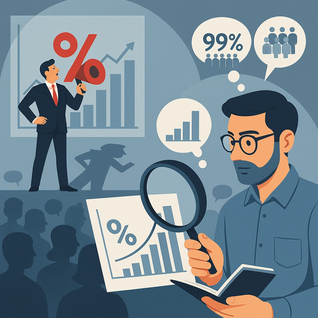
Warning Fake Analyst
Statistics help when read with care; interpretation makes the difference — beware of self‑styled “analysts” who sling percentages to steer you.
The trap of raw numbers
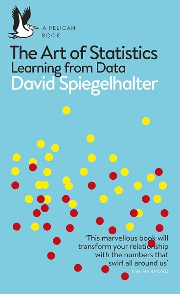
Today, we live in a world where anyone can easily publish numbers, share survey results, or even claim to be a “data expert” after a few quick Google searches. However, as statistician David Spiegelhalter brilliantly reminds us in his book The Art of Statistics, data alone doesn’t tell the full story—it’s the interpretation that changes everything.
“Data do not speak for themselves. We speak for them.”
— David Spiegelhalter
The misleading 99% example
Let’s look at a concrete example Spiegelhalter cites, drawn from a public awareness campaign by the city of London. The campaign proudly claimed: “99% of young Londoners do not commit serious violent acts.” At first glance, the message feels reassuring and positive. But on closer inspection, the remaining 1% still represents about 10,000 young people—meaning there could be 10,000 individuals involved in serious violent crimes. So the supposedly comforting statistic actually hides a rather alarming reality.
Now imagine reading a headline like: “The majority of crimes in France are committed by foreigners.” A statement like that immediately grabs attention and causes concern. But dig a little deeper and you’ll find that the underlying statistics are often oversimplified—or even misleading.
In fact, data collection often relies on binary labels like “French” or “non-French.” But the category “non-French” may include individuals whose origin is unknown, such as undocumented people at the time of arrest, those who refuse to answer, or even people born in France who haven’t yet acquired citizenship.
The result? An artificially inflated category that distorts the picture and can unfairly fuel stereotypes.
Context changes everything
This is a clear example of how poorly interpreted data can mislead the public. It highlights the crucial need for analysis carried out by qualified professionals.
Similarly, Spiegelhalter often refers to another well-known case: the increased risk of colorectal cancer among bacon sandwich lovers. Saying the risk increases by “18%” may sound terrifying— but in reality, it only means going from 6 to 7 cases per 100 people. Without the proper context, this kind of figure can easily mislead and exaggerate the actual risk.
How to avoid statistical traps
So, how can you avoid falling for these statistical traps? Here are some guidelines inspired by the rigorous standards of genuine data professionals:
- Check the methodology: A large sample size doesn’t automatically make it representative. True analysts understand that serious studies require meticulous methods.
- Be cautious of attractive graphs: Charts can easily deceive by using truncated axes or misleading visual presentations.
- Understand correlation vs causation: Two variables moving together doesn’t necessarily imply a cause-and-effect relationship. Professional training and deep understanding help distinguish these critical subtleties.
Conclusion: Numbers don’t lie—people do
Trusting data is important, but blindly trusting anyone interpreting them is dangerous. Genuine mastery of statistics requires years of study, experience, and critical thinking. So, next time you hear a spectacular claim supported by numbers, ensure those numbers have been handled by a real professional—someone who truly knows how to let the data speak honestly.