
From Numbers to Emotions: The Rise of Interactive Data Storytelling
From raw numbers to real narratives: interactive visuals turn data into decisions and invite everyone to explore.
We live in the age of data. But faced with a deluge of figures, who hasn’t sighed at the sight of an endless Excel sheet? To meet this challenge, an irresistible trend is taking hold: data storytelling and interactive visualization. But what does this actually change? Let’s dive into this revolution that turns data analysis into a truly living experience.
Telling stories with numbers: why does it work?
Data storytelling is the art of turning raw data into captivating narratives. Gone are the days of cold reports: make way for presentations that structure numbers like the chapters of a novel. Why is this approach booming? Because it answers an essential need: giving meaning to information, capturing attention, and making analysis accessible to everyone. According to Gartner, by 2025 “data stories” will be the preferred way to consume analytics, ahead of traditional dashboards.
A good story is far more memorable than a statistic: research shows that a fact embedded in a narrative is up to 20 times more likely to be remembered! Companies, media outlets and even public institutions are seizing on it to get messages across, convince, and mobilize.
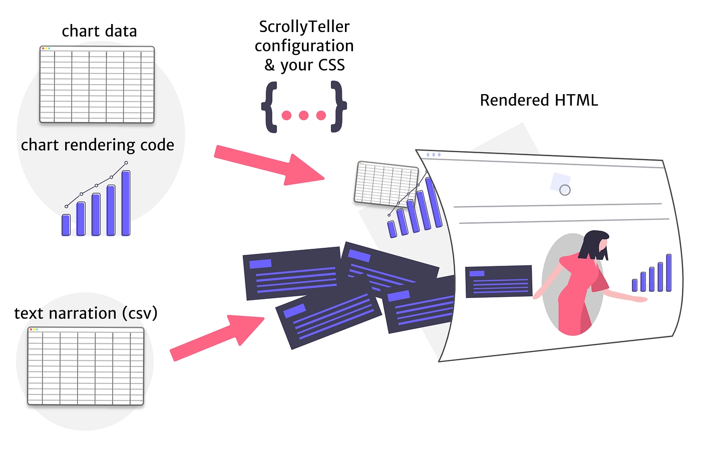
Interactivity, the key to understanding
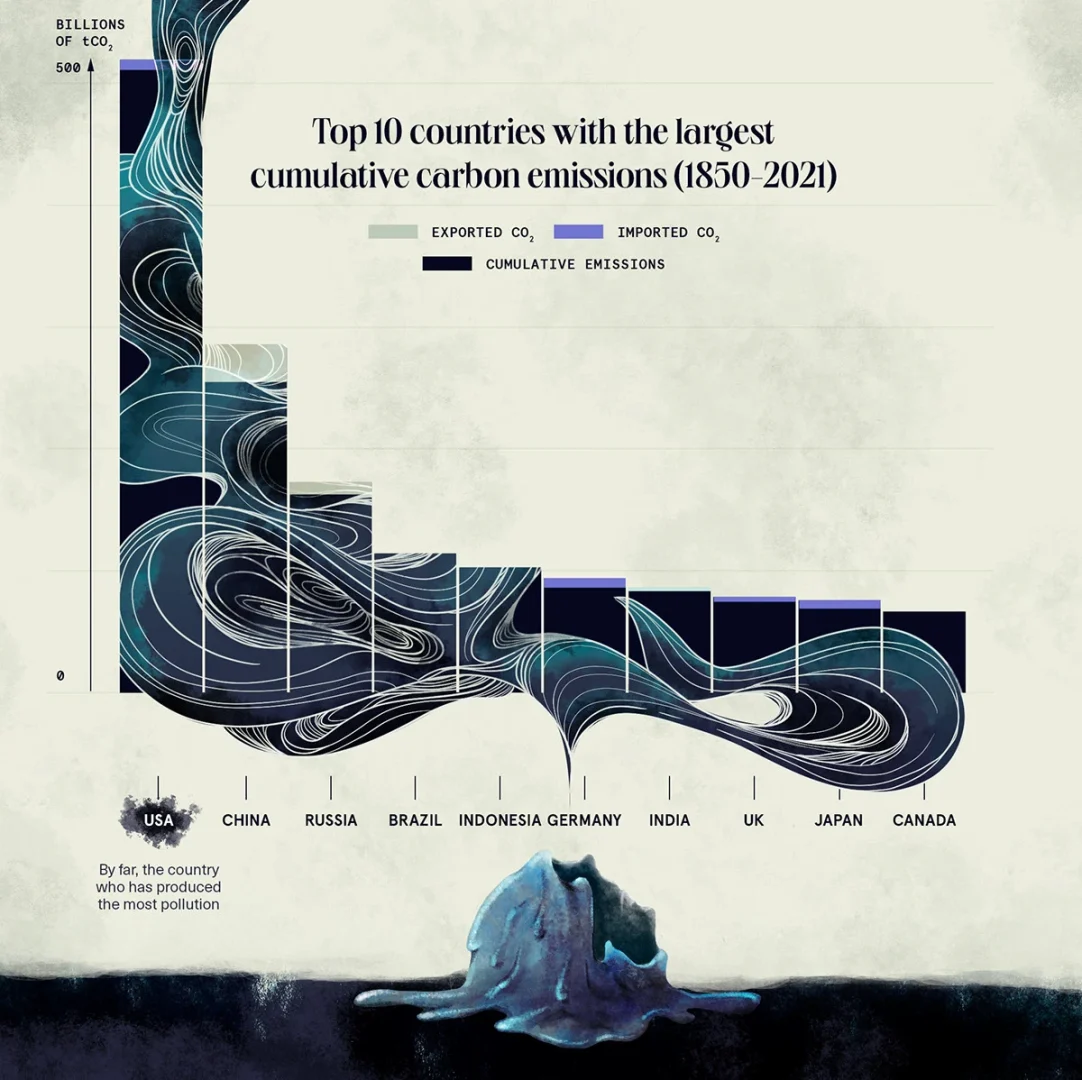
The real revolution is interactivity. Thanks to interactive visualizations, anyone can explore data: filter, zoom, click… It’s no longer a passive experience but a discovery game where the user becomes the actor. Interactive content captures attention better and makes understanding easier, especially in a world where we retain more of what we see and manipulate. A good example? The famous “Spotify Wrapped”: each year, the platform unveils a personalized retrospective of users’ musical year, in the form of animated stories to share. A playful, viral data narrative that brings individual statistics to life. In another vein, public COVID-19 tracking dashboards allowed everyone to follow the pandemic’s evolution in real time, in just a few clicks.
Tools for everyone

The rise of data storytelling is built on increasingly accessible tools. Giants like Tableau, Power BI or Looker Studio let anyone create dynamic charts and dashboards without writing a single line of code. For interactive narratives, platforms such as Flourish, Toucan Toco or Datawrapper attract both journalists and corporate communicators.
The principle: make data speak, even to non-specialists. A well-designed chart, an interactive infographic or an animated map can explain complex phenomena in seconds, without technical jargon. Data storytelling democratizes access to information and enhances collective intelligence.
Benefits for all

Telling a story with data accelerates decision-making, unites people around a common vision, and builds confidence even among those who don’t feel like “experts.” The impact is immediate: more effective meetings, better-understood decisions, better-supported projects.
Beyond a fad, this is a real long-term movement. With the explosion of data and the arrival of artificial intelligence, the need for meaning and clarity has never been stronger. Data storytelling, enriched by interactivity, reconciles analytical rigor with the art of narration. Numbers are no longer cold: they tell, inspire, and engage.
In conclusion: data becomes alive, accessible, and ready to take everyone on an adventure where understanding also means feeling. Ready to write the next story with your data?
(Sources: Gartner, MIT Sloan Management Review, Exploding Topics, Apogea, Canva, Orixa Media, sector reports 2024–2025)
Images credit : Gabrielle Merite